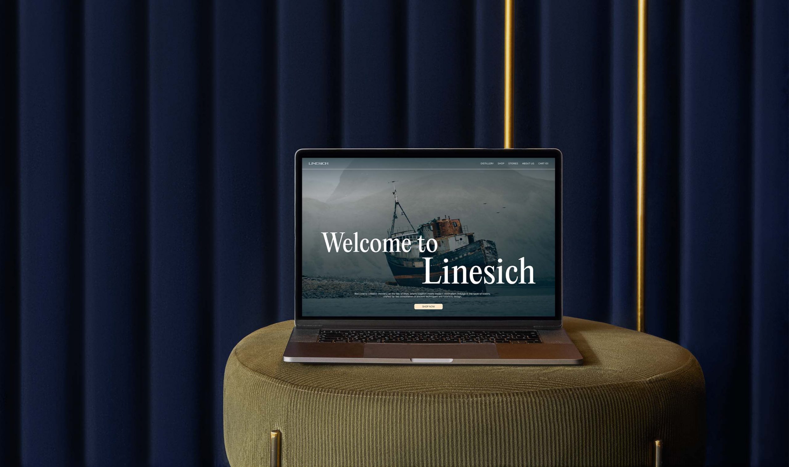
Linesich Distillery
UX / UI Design
Case study
Year: 2023
Hey there, this is the default text for a new paragraph. Feel free to edit this paragraph by clicking on the yellow edit icon. After you are done just click on the yellow checkmark button on the top right. Have Fun!

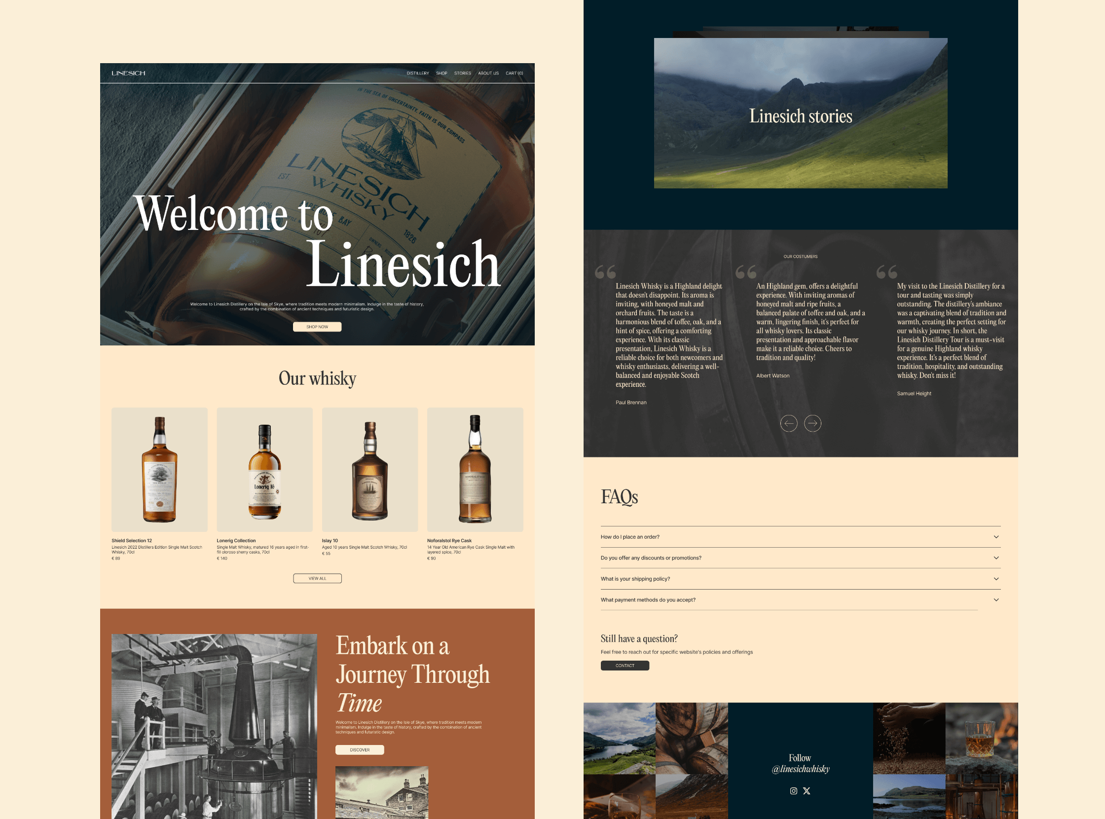
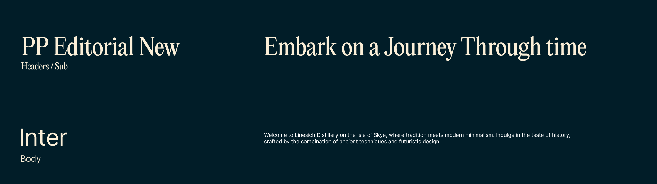
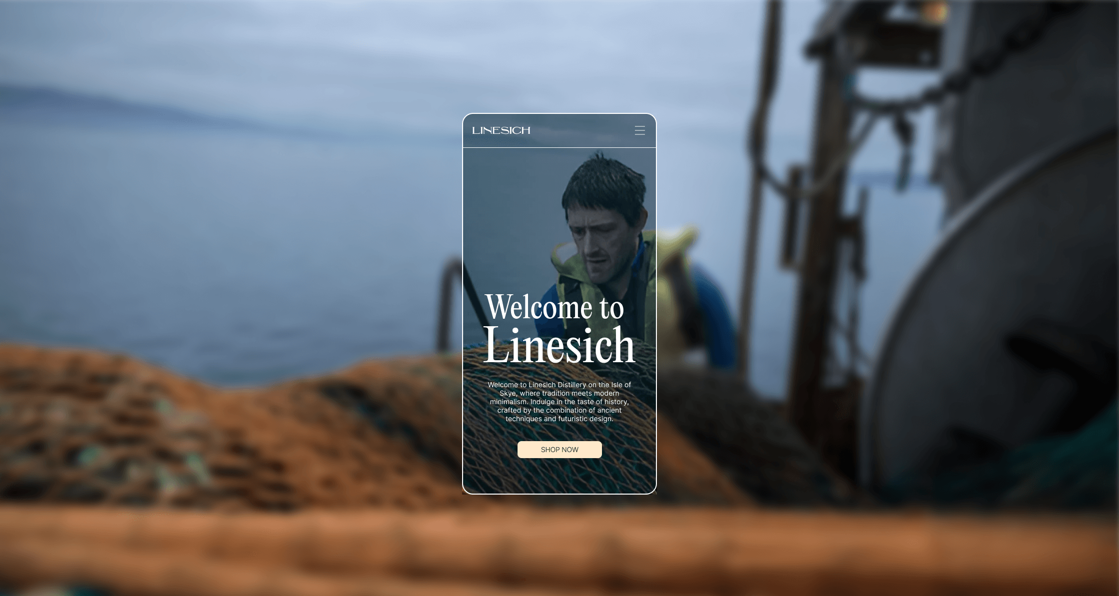
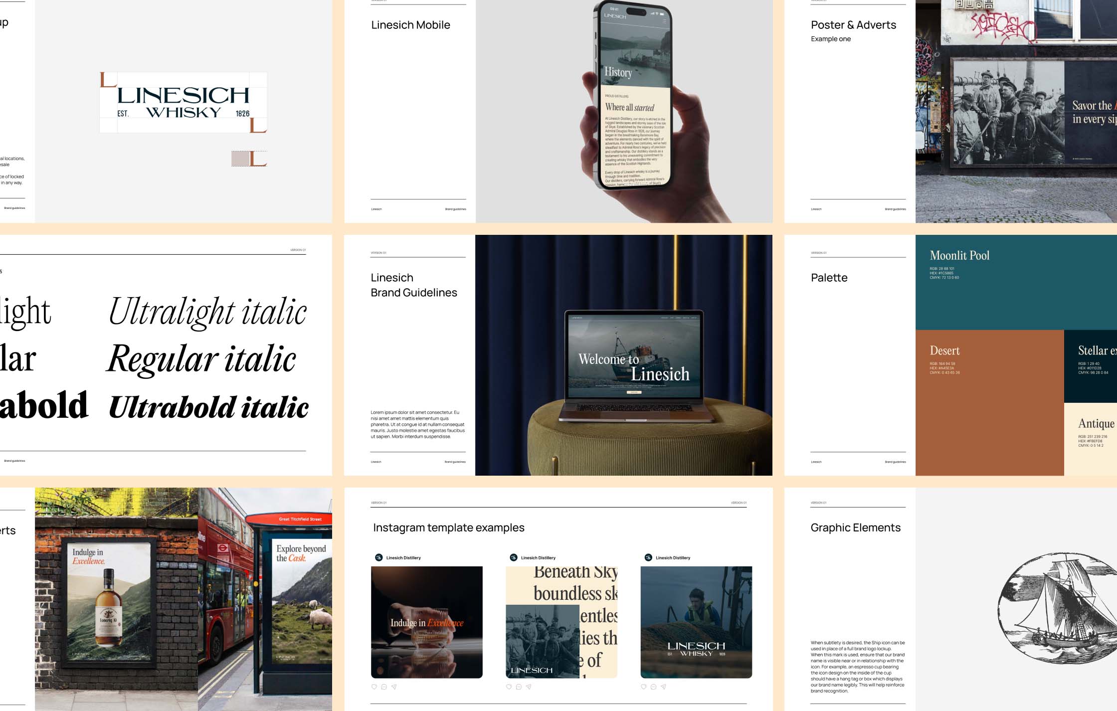
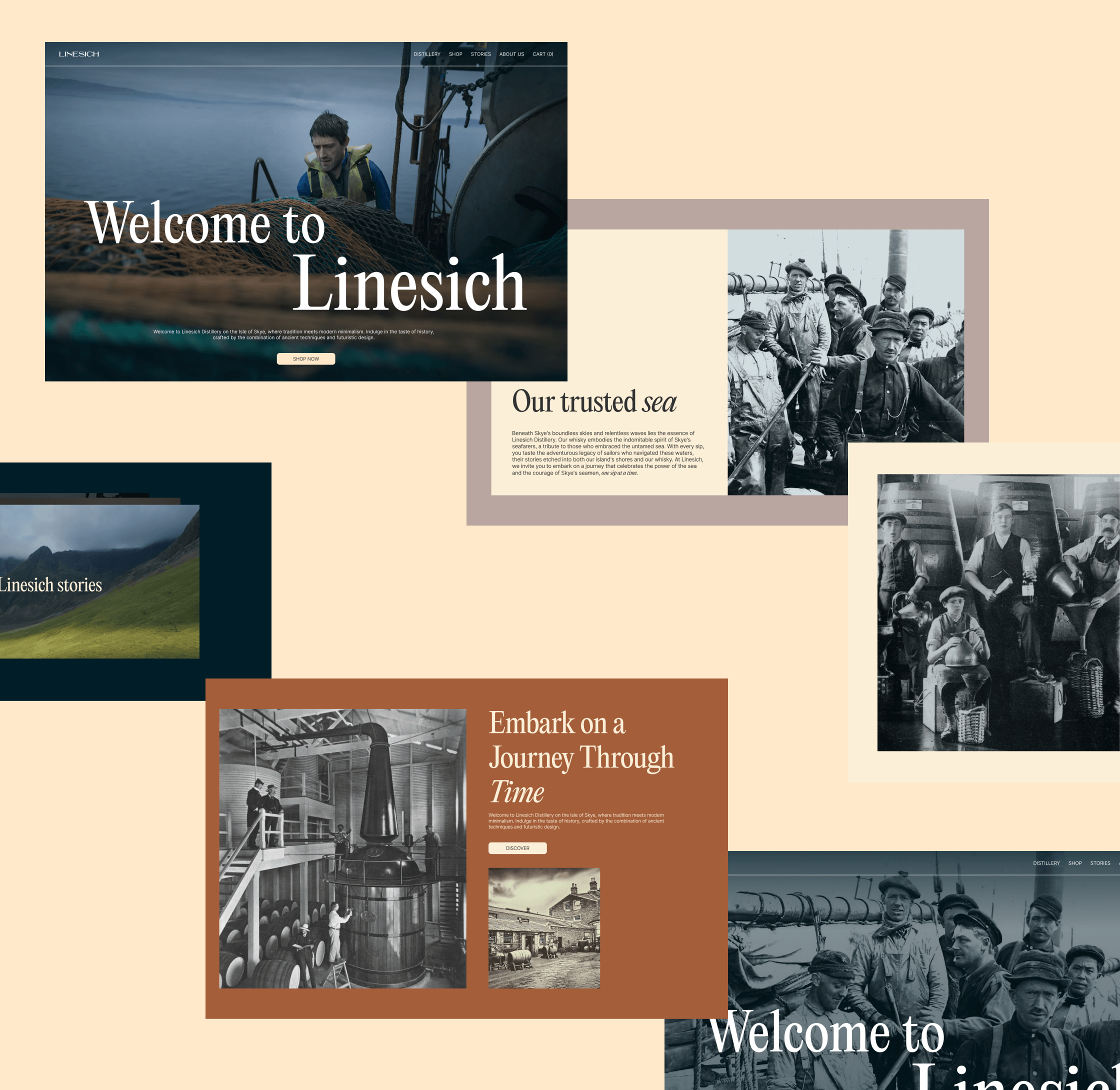
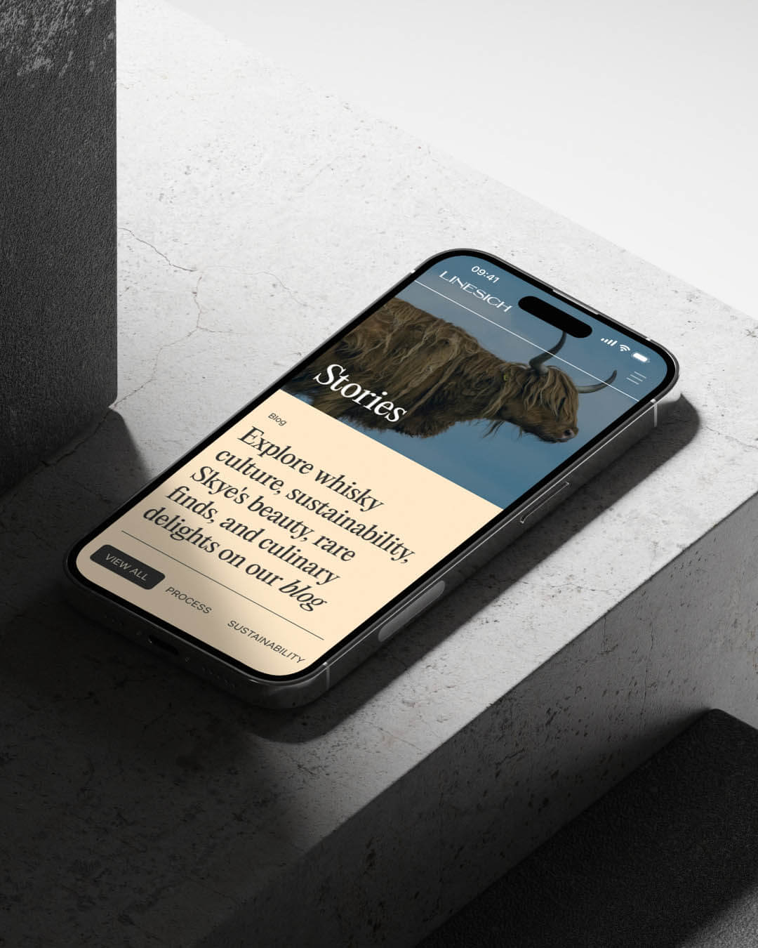
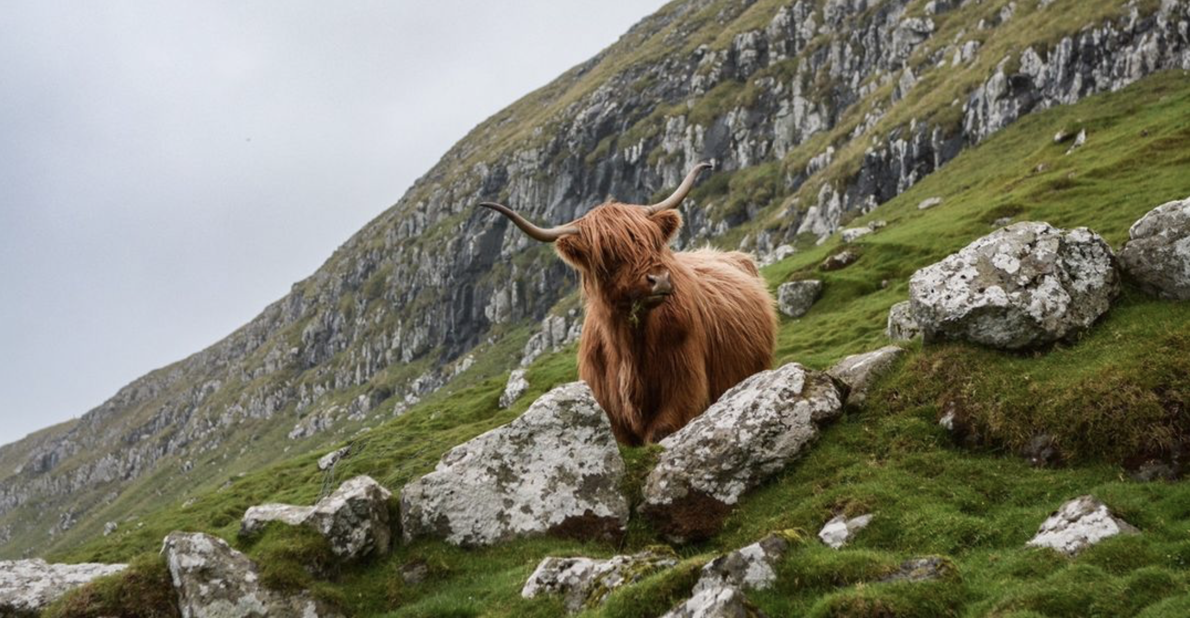
Linesich Distillery's brand identity is a vivid tribute to Skye's spirit. Logo, palette, typography, and product labels were created to narrate tales of craftsmanship and heritage.
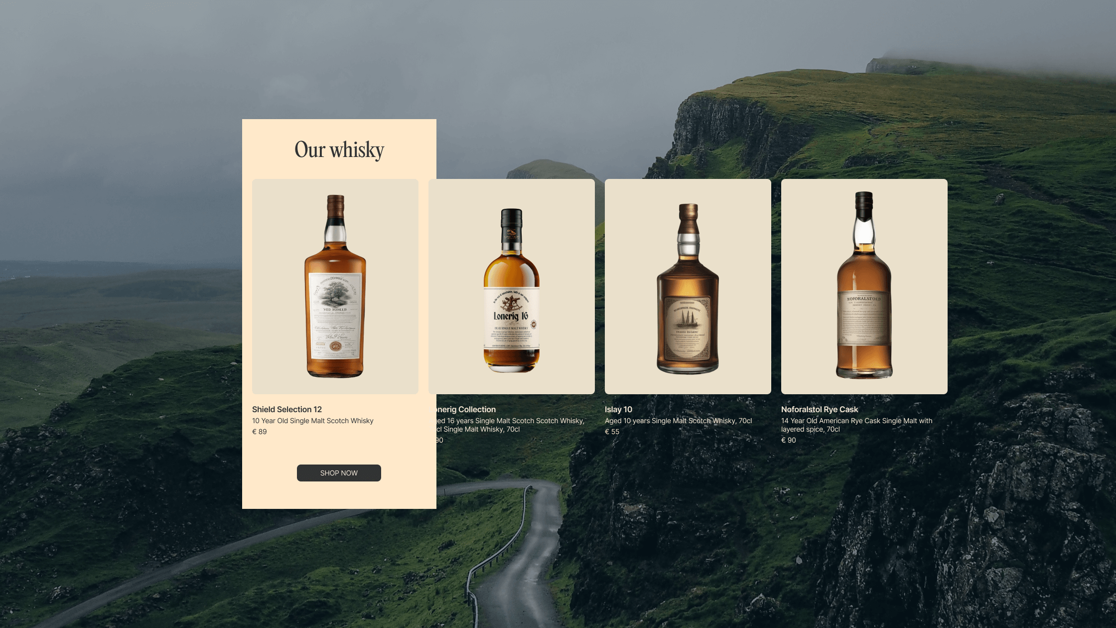
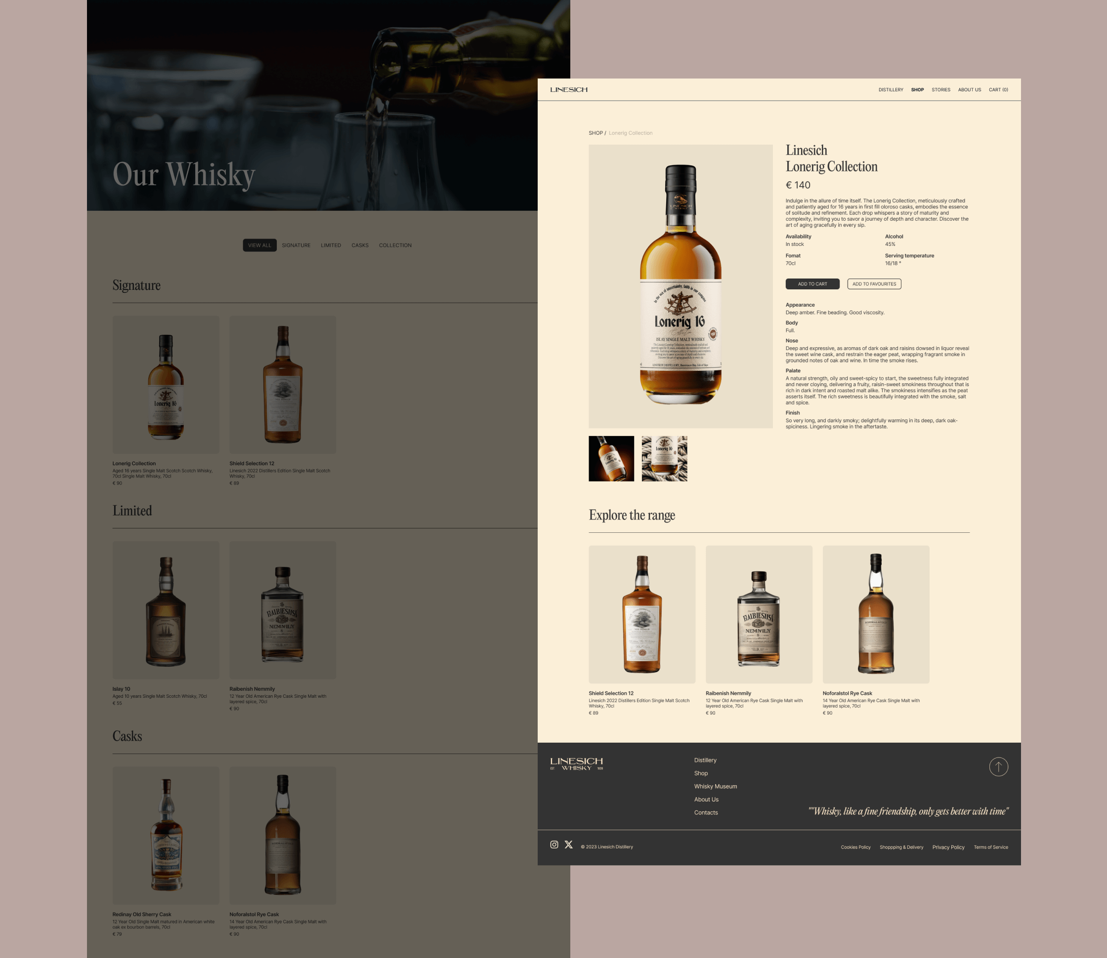
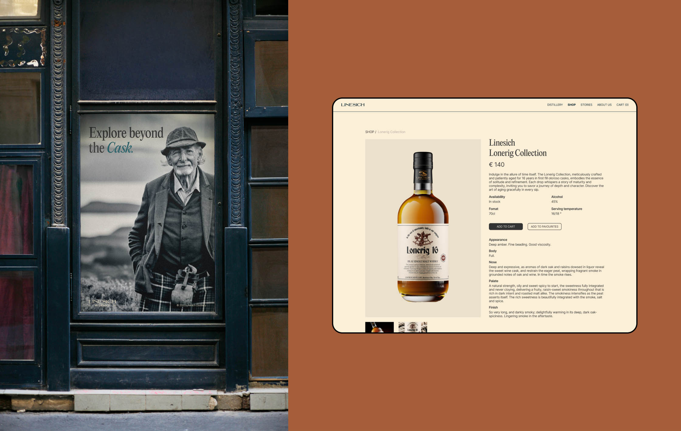
The heart of the distillery lies in its whisky, and I've designed labels that do justice to the legacy of Linesich. Each bottle label narrates a story—a story of craftsmanship and the pristine beauty of Skye. These labels not only enhance the product but also serve as collectible works of art.

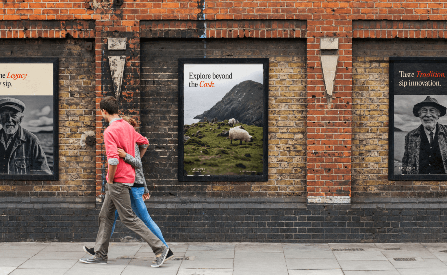
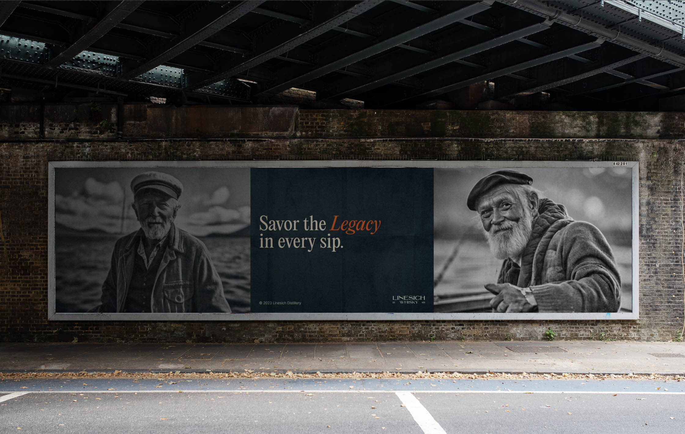
To introduce Linesich to the world, I've created a series of advertisements that capture the allure of Skye and the art of whisky-making a and the strong connection between the brand and the people of Isle of Ske.
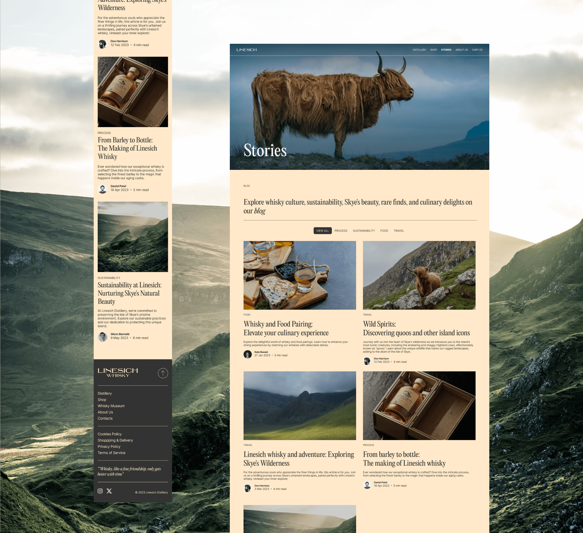
These visuals and narratives encapsulate the mystique of the distillery and the tradition, enticing enthusiasts to explore and indulge in Linesich's creations.