Brand, Logo, Marca e brand identity, quali sono le differenze

gravatar
By Fulvio
 · 
Aprile 23, 2020
 · 
4 min read
Featured Image

Si sente sempre più parlare di Brand, della necessità di avere un logo riconoscibile per la propria azienda. Ma di cosa si tratta, quali sono le differenze?

Quando si parla di marchio, logo, emblema e brand identity è difficile capire se queste parole facciano riferimento ad uno stesso soggetto. Al termine di questo articolo conoscerai le differenze e potrai utilizzare correttamente questi termini. Partiamo dal principio e analizziamo insieme questo argomento facendo chiarezza sui singoli termini.

Marca è la parola che in italiano si riferisce ai valori legati all’impresa e ciò che i consumatori associano ad essa. La percezione di questi valori viene trasmessa da un’impresa con la propria attività di Branding. Brand è semplicemente la traduzione di marca in Inglese e viene usato sempre più spesso in ambienti di lavoro internazionali.

Ad esempio Tesla è una Marca/Brand di automobili elettriche che viene direttamente associata a dei valori quali: innovazione, sostenibilità e lusso. Questa frase di Scott Cook è una spiegazione molto efficace di questo concetto

“Una marca non è più ciò che diciamo al consumatore, è ciò che i consumatori si dicono reciprocamente di quella marca” Scott Cook

Parlando di Marca non si può che parlare di Marchio.

Il Marchio è l’elemento che ha lo scopo di rendere unico un prodotto o un’attività, più è distintivo il marchio più sarà facile associarlo direttamente al prodotto o all’impresa. E’ compito di quest’ultima lavorare in modo che il proprio marchio sia conosciuto e che comunichi i valori che si vogliono associare al proprio brand/marca.

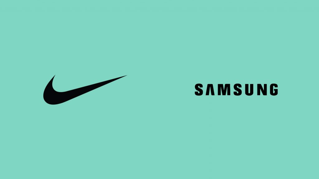
Vi starete giustamente chiedendo che parte abbia il Logo in un Brand e se non siano la stessa cosa. Emblema e Logo fanno parte del Marchio e si riferiscono all’elemento grafico che distingue il Marchio. Detto questo possiamo notare una differenza evidente tra Emblema e Logo in questo  esempio:

Il primo, il famosissimo “swoosh” Nike, è un elemento grafico, un emblema (o pittogramma), mentre il secondo, Samsung è rappresentato da una scritta, un Logo.

Lo swoosh Nike, il cavallino Ferrari o la mela Apple sono definiti Emblemi, cioè disegni grafici che distinguono il marchio non esprimendolo in lettere. Samsung, Coca-Cola e Pirelli sono invece rappresentati da una scritta, anche se elaborata graficamente, quindi un Loghi.

Riassumendo:

Il Marchio è un Logo o un Emblema che rende riconoscibile una Marca / Brand.

La Marca / Brand sono la somma del Marchio e dei Valori che esso rappresenta. Quando un Marchio è una scritta si chiama Logo, quando un Marchio è un disegno grafico si chiama Emblema (o Pittogramma).

Cosa fare per modificare la percezione del proprio brand

La prima cosa a cui si pensa parlando di un Brand è inevitabilmente il suo Marchio, ma come abbiamo appena letto non è l’unica cosa che conta; infatti, nonostante sia l’associazione più veloce, ci sono altri elementi che possiamo associare al brand e modificarne i valori percepiti dalle persone.

Branding

Tutte le azioni prese per costruire consapevolezza e reputazione intorno alla vostra azienda e ai suoi prodotti o servizi sono Branding. Il branding ha lo scopo di creare l’immagine della vostra azienda. Non c’è una formula esatta per tradurre questa immagine nella mente dei vostri clienti, ma le possibilità di successo aumentano se si segue una strategia precisa.

Brand Identity

L’insieme di elementi tangibili del brand come il logo, i colori e la voce, creano l’Identità di Marca o Brand Identity. Più questi elementi sono distinti e specifici, più alta è la possibilità di creare un brand differenziato e più facilmente riconoscibile.

Brand Awareness

La consapevolezza del brand, o Brand Awareness, è il livello di consapevolezza del consumatore di un’azienda. Misura la capacità di un potenziale cliente non solo di riconoscere un’immagine di marca, ma anche di associarla al prodotto o servizio di una determinata azienda.

Ora che abbiamo fatto chiarezza sui termini più utilizzati, nella costruzione dell’identità del vostro brand, siate sicuri che ogni suo elemento rispecchi la percezione che volete dare ai vostri clienti.

Conoscendo la differenza tra termini spesso confusi come logo, marchio, brand e brand identity siete già sulla strada giusta per creare un brand di successo!

Tagged: brand · branding · logo · marca

In today's competitive business environment, branding has become more critical than ever. A strong brand identity can help a business stand out from the crowd and create a loyal customer base. In UI design, branding plays a crucial role in creating an effective user experience. In this article, we will explore the importance of branding in UI design using recent market examples.

Branding is about creating a consistent visual language that reflects a brand's values, mission, and personality. It involves creating a unique logo, color palette, typography, and other visual elements that differentiate a brand from its competitors. In UI design, branding is about creating a consistent visual language that reflects a brand's identity and creates a memorable user experience.

One example of effective branding in UI design is the redesign of the mobile app for Starbucks, the world's largest coffeehouse chain. In 2018, Starbucks revamped its mobile app to create a more personalized and engaging user experience. The app features a consistent color scheme of green and white, which is instantly recognizable as Starbucks' brand colors. The app's typography and visual design also reflect the brand's identity, with clean lines and bold, easy-to-read text.

Another example of effective branding in UI design is the redesign of the Airbnb website. The online marketplace for lodging and vacation rentals underwent a major redesign in 2014, which included a complete overhaul of its branding. The new design features a distinctive logo and color scheme that reflects the brand's values of hospitality and community. The typography and visual design are also consistent with the brand's identity, with clean lines and an emphasis on high-quality photography.

The importance of branding in UI design is not just limited to major corporations. Even small businesses can benefit from a strong brand identity in their UI design. One example is the website for the independent bookstore, McNally Jackson. The website features a consistent color scheme and typography that reflects the brand's identity as a place for literary enthusiasts. The site's design is clean and minimal, with a focus on the bookstore's selection of books.

Here are two more examples of effective branding in UI design from last year:

Peloton, The fitness leader

The fitness technology company, Peloton, is known for its interactive home fitness equipment and app. In 2021, the company underwent a rebranding effort, which included a new logocolor palette, and visual identity. The new branding was reflected in the company's UI design, including its app and website. The new branding features a boldmodern design with a black-and-white color scheme and a focus on high-quality photography. The typography is also clean and modern, with a sans-serif font that reflects the brand's identity as a high-tech fitness company. Overall, the new branding and UI design create a cohesive user experience that reinforces Peloton's brand identity as a leader in the fitness industry.

Slack, the messaging platform

Slack, underwent a major redesign in 2021, which included a new branding effort. The new branding features a new logo and color palette that reflect the company's identity as a communication tool for businesses. The new UI design also reflects the new branding, with a focus on simplicity and ease of use. The typography is clean and easy to read, with a sans-serif font that reflects the brand's identity as a modern communication tool. The color palette features shades of purple, blue, and green, which create a calming and professional atmosphere. Overall, the new branding and UI design create a user experience that reinforces Slack's identity as a reliable and efficient communication tool for businesses.

In both of these examples, effective branding is reflected in the UI design of the company's products. The new branding and UI design create a cohesive user experience that reinforces the brand's identity and values.

In conclusion

Branding is crucial for businesses to stand out in a crowded marketplace and create a memorable user experience in UI design

The examples of Starbucks, Airbnb, McNally Jackson, Peloton, and Slack demonstrate how effective branding can help businesses differentiate themselves and create a loyal customer base

The examples of Starbucks, Airbnb, McNally Jackson, Peloton, and Slack demonstrate how effective branding can help businesses differentiate themselves and create a loyal customer base

By investing in a strong brand identity and UI design, businesses can create a cohesive user experience that reinforces their values and identity, ultimately leading to increased customer loyalty and brand recognition.

Whether you are a large corporation or a small business, investing in effective branding in your UI design can pay off in the long run and help you stand out from your competitors.


Overall, branding in UI design is crucial for businesses to create a memorable and cohesive user experience. The examples of Starbucks, Airbnb, McNally Jackson, Peloton, and Slack demonstrate how effective branding can help businesses differentiate themselves from their competitors and create a loyal customer base.

View